


Review your web pages in the new Central 2025 templates.
The new templates will make your pre-existing content types look different, and many will have new features or functionality. There may be cases where you want to reconsider how those content types are used. Also, consider if there are places where you could employ the all-new content types.
Please review all of your web pages, paying especial attention to the most viewed and top-level landing pages.
Some specific areas of concern are identified below. Communications can assist you with identifying which pages are affected by the mentioned issues.
Thumbnail List Item
The image dimensions for the Thumbnail List Items content type are noticeably larger than they used to be.
Please make sure the thumbnail images are at least 175px x 175px. If you select the new Large Image style option, then the images will need to be much larger (888px x 888px recommended).
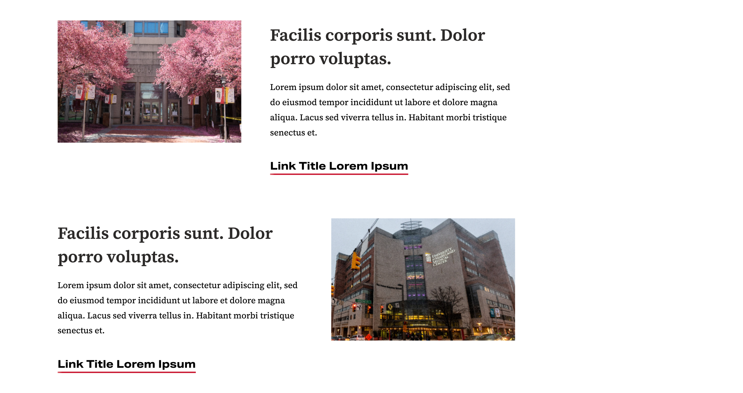
Features (formerly Slides)
One of the more dramatic changes to a preexisting content type is the change from Slide to Feature.
Instead of acting as a slideshow, where viewers only see one slide at a time, each Feature will display above or below the other. The Feature's image will display to the left or right of the header and text.
The image dimensions have also changed, displayed at a more square aspect ratio. Ideal image dimensions should be at least 888px x 684px.
Features are no longer aggregated into a "Slideshow" container, meaning that each Feature will display wherever you have placed it on the page.
Also, the links that were formerly just for the slide images are now output below the text in the new templates. In the old templates, content editors would often add the same links to the link field, and again in the Text box. Please check that this change hasn't created double links in your Features, and if it has please delete the redundant link in the Text box.
Please review the Features on your websites to make sure they're positioned appropriately, have suitable image dimensions, and include the appropriate header, text, and/or link(s) to accompany the image.
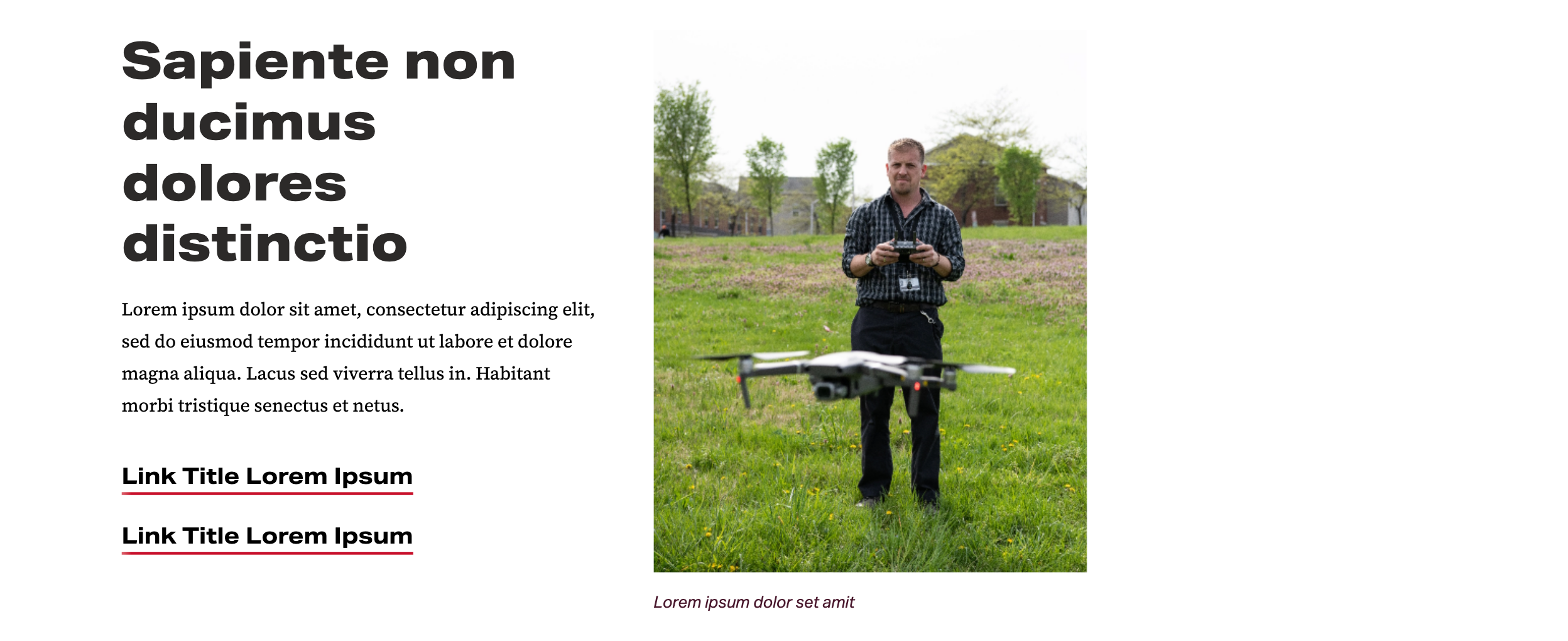
To give extra prominence to a Feature, consider adding one Feature (Tall) content type to your page. It works similarly to the other Features, but with a much taller image size (ideally 888px x 1200).
We recommend using the Feature (Tall) content type sparingly, one per page. This content type was formerly named Header Image.
People Listing
The all-new People Listing content type should be used for all faculty and staff bios posted on the website moving forward.
Communications will be using a system where all web bios are mirrored from a central folder so that any bio can be easily updated across multiple pages of the website. More details to be added.
Quick Links
The old Quick Links content type is being discontinued. Please replace any examples with the all-new Related Resources content type. Or, if the Quick Links are paired with a Contact Box, replace them both with the new Contact Box + Related Resources content type.
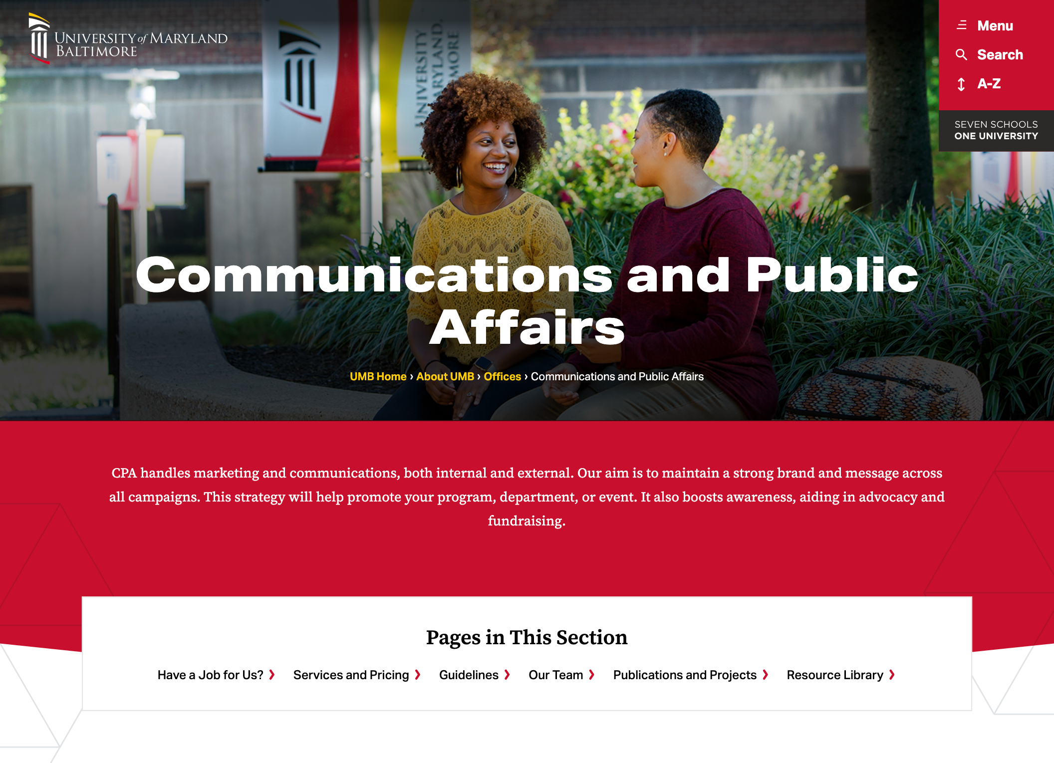
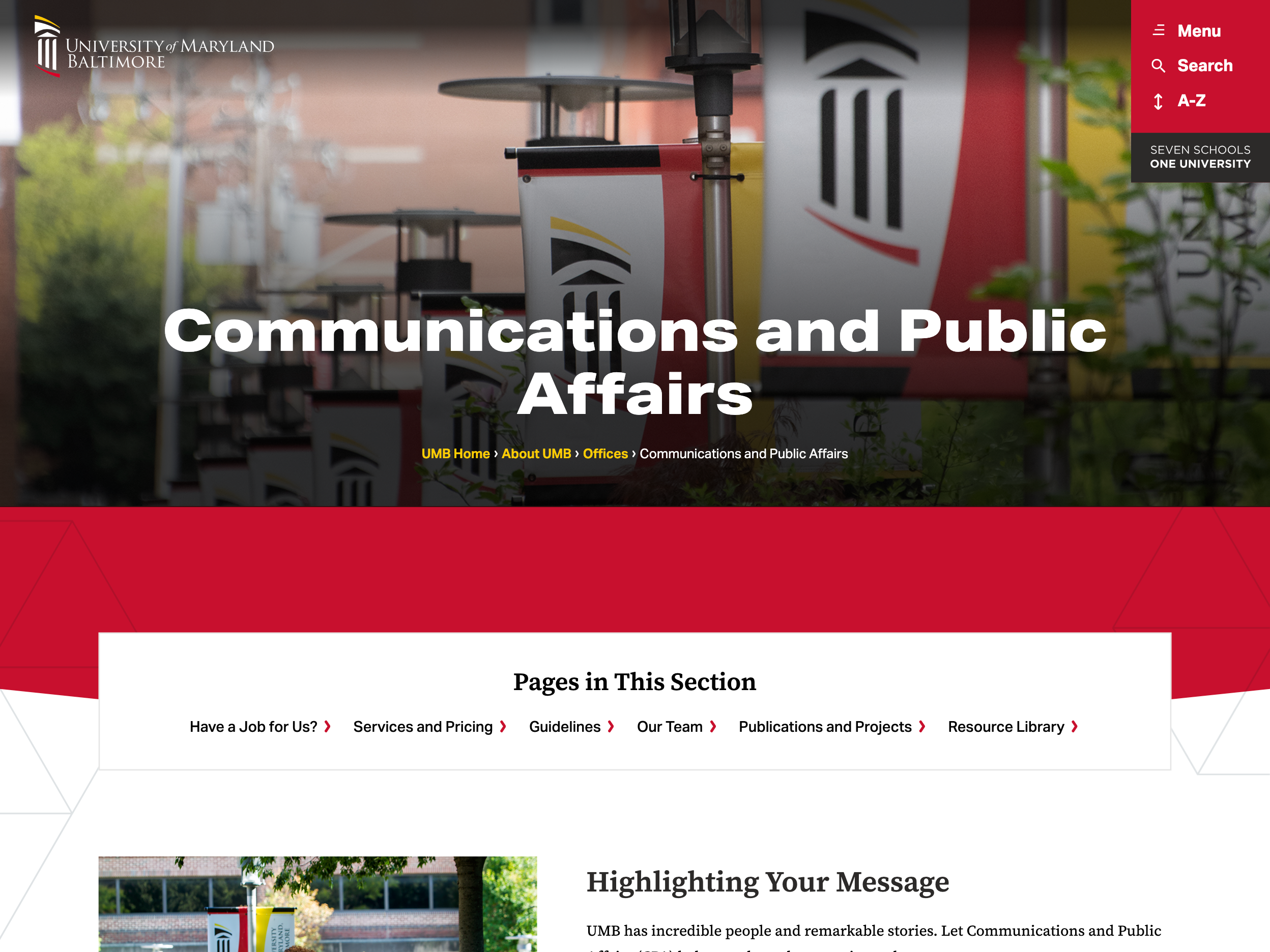
Branch Banner and Introduction
One new feature is that every branch of the website will have a banner image and space for introductory text.
As of this writing, most websites will show a default placeholder for the banner image, and the introductory text will be missing. This is only temporary. More details will be forthcoming.
Example:
Example of default placeholder: